
In this graphic design project, I was tasked with creating eye-catching and informative packaging for a new brand of breakfast cereal. One of the primary goals was to effectively convey the brand's identity and the product's features, enticing consumers to purchase the cereal.
I utilized the famous psychological test, the “Rorschach test,” as a sort of inspiration for the design and theming of my cereal box design. The general audience of the brand would be older, ranging from around 20 to 40.
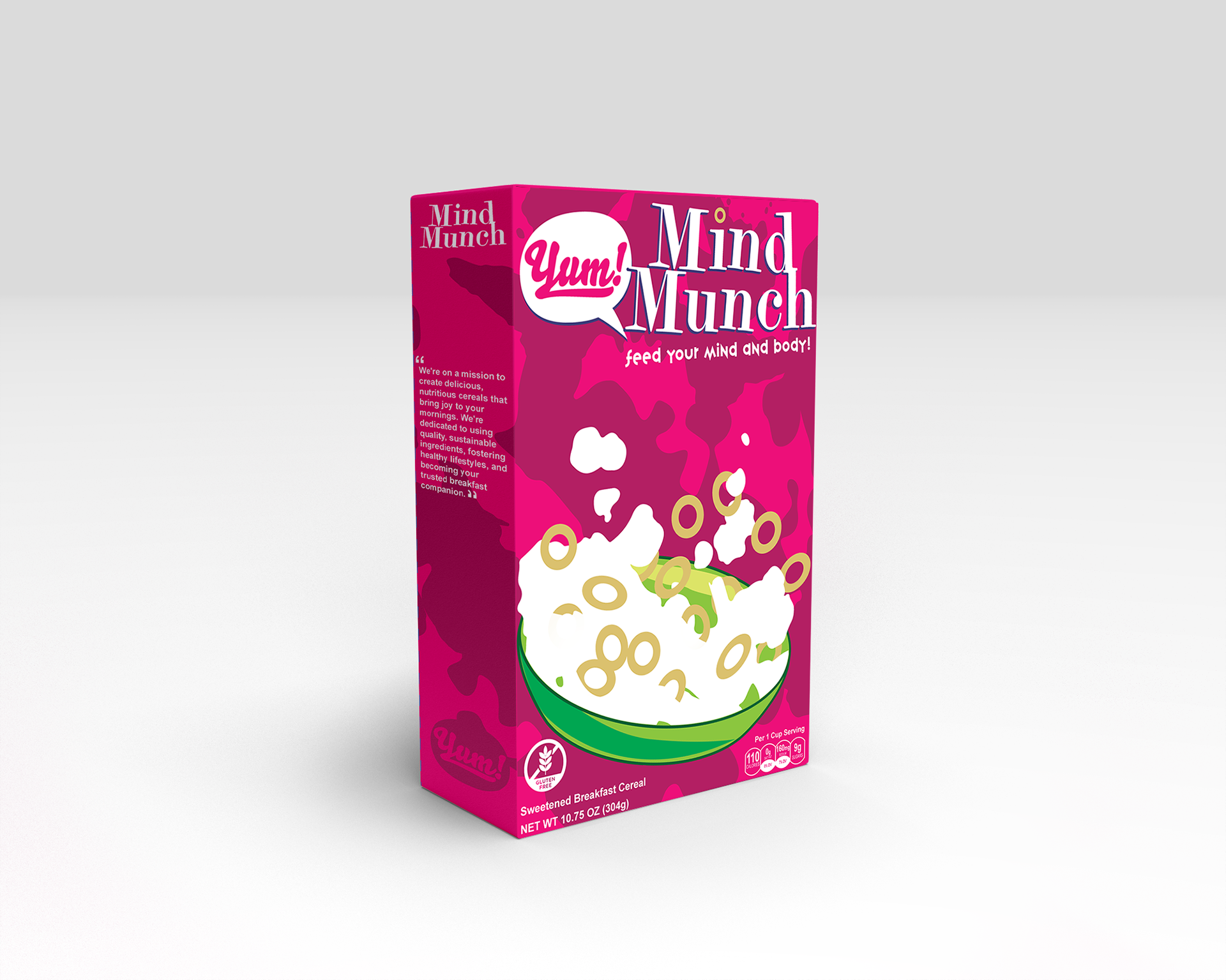
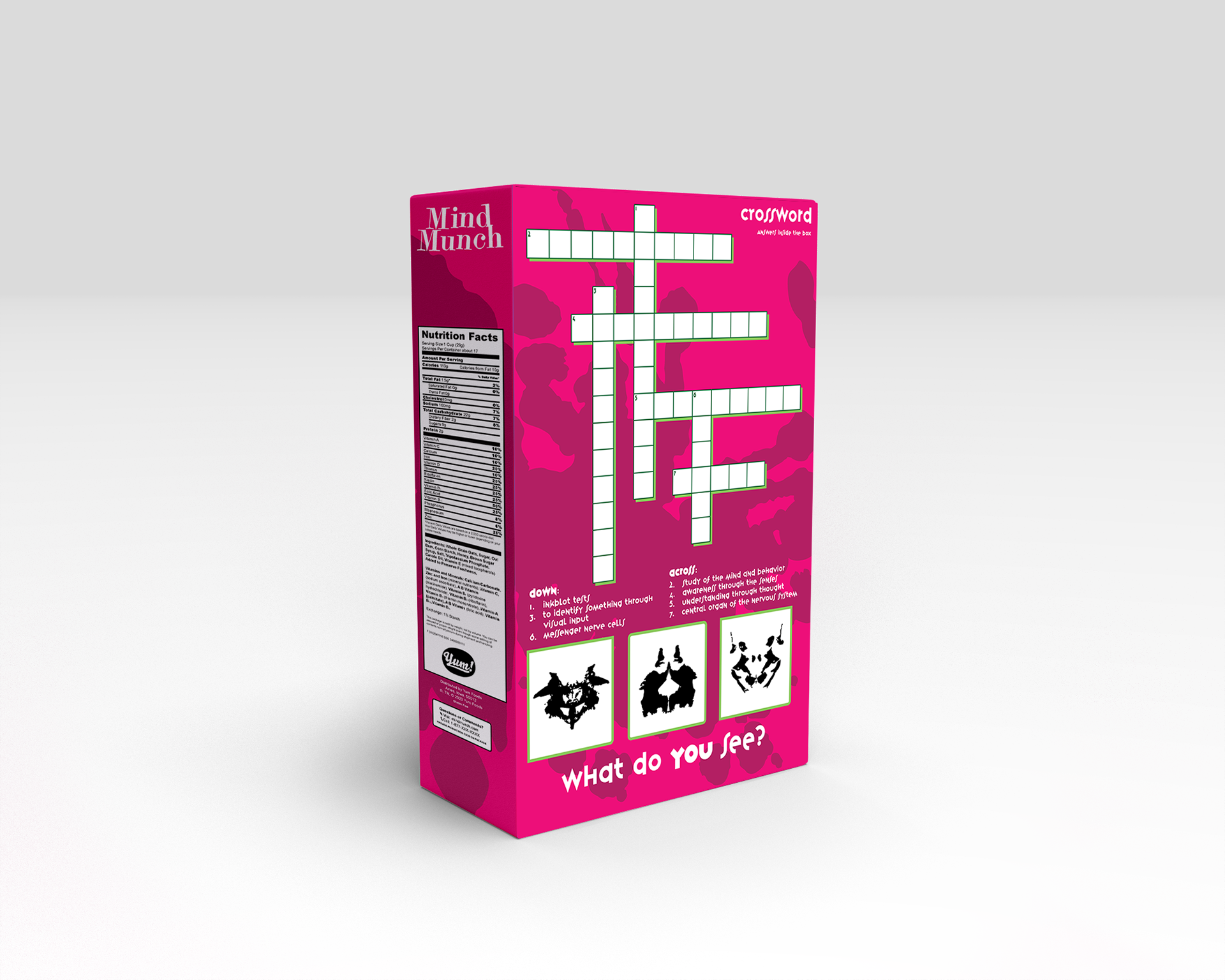
When coming up with ideas for my cereal box design, I had a few different ideas that came to mind. Some were more of a concept or just a general theme for a box, but others were a bit more fleshed out and such. I was particularly interested in a theme that was fun and unique for a cereal brand, and I ended up going with the Rorschach test (also known as the inkblot test) as I felt I could create a sort of quirky and interesting design.
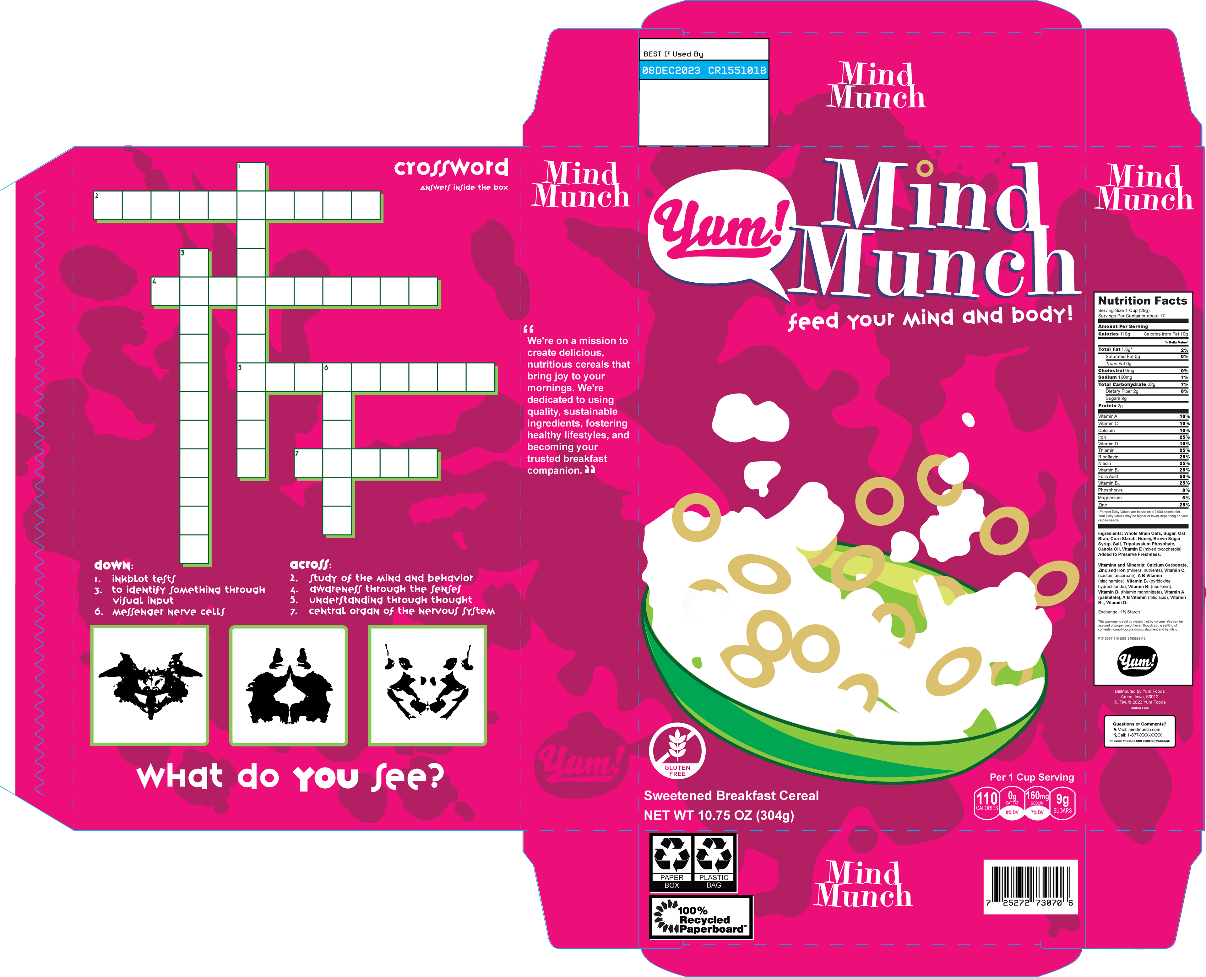
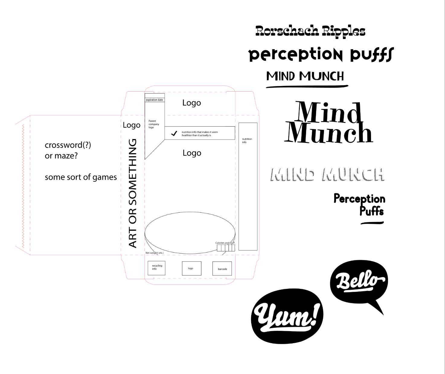
One of the first steps taken with the cereal box was to simply block out and label various parts of the box in Adobe Illustrator. I drew reference from many real-life cereal brands in an attempt to emulate the look and feel they have to make my box seem as though you could realistically see it on a store shelf. I also began trying out various logos and branding for the cereal as well as for the parent company that would own the cereal.
Once I had the general framework set in place I began to create the various components of the design as well as creating vector artwork of the inkblots utilized in the Rorschach test.
I initially decided when designing the cereal box that I wanted to go for a complimentary color scheme as I felt it would establish a visually striking and eye-catching feel to the design. I wanted to have the primary color of the box be something that wasn’t very common in many commercial cereal boxes to help make it stand out more.
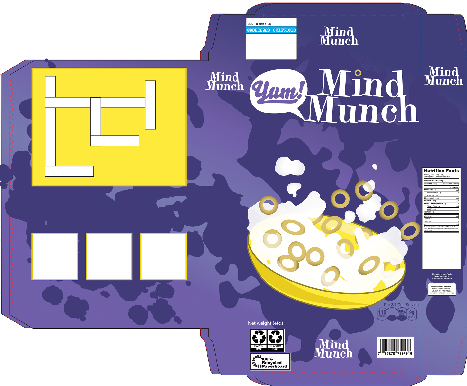

Originally I had went with a purple and yellow color scheme as a sort of placeholder. I decided to switch from the purple and yellow color scheme to a magenta and green design as the magenta resembled that of the human brain and was more thematically consistent with my brand. Ultimately I felt the magenta and green design held more visual interest and appeal and opted to utilize that color scheme.
