In this project, I explored the characteristics involved in rebranding for a client of my choice. It was important for me to understand my client, as each one has a unique style and tone that must be respected. I made sure the client aligned with my design voice and that I felt a strong connection to both the client and their audience. I chose to work with the Vinyl Grind cafe is a local record and coffee shop found in downtown Ames, Iowa. I chose the Vinyl Grind as I greatly enjoyed their friendly atmosphere and local feel.
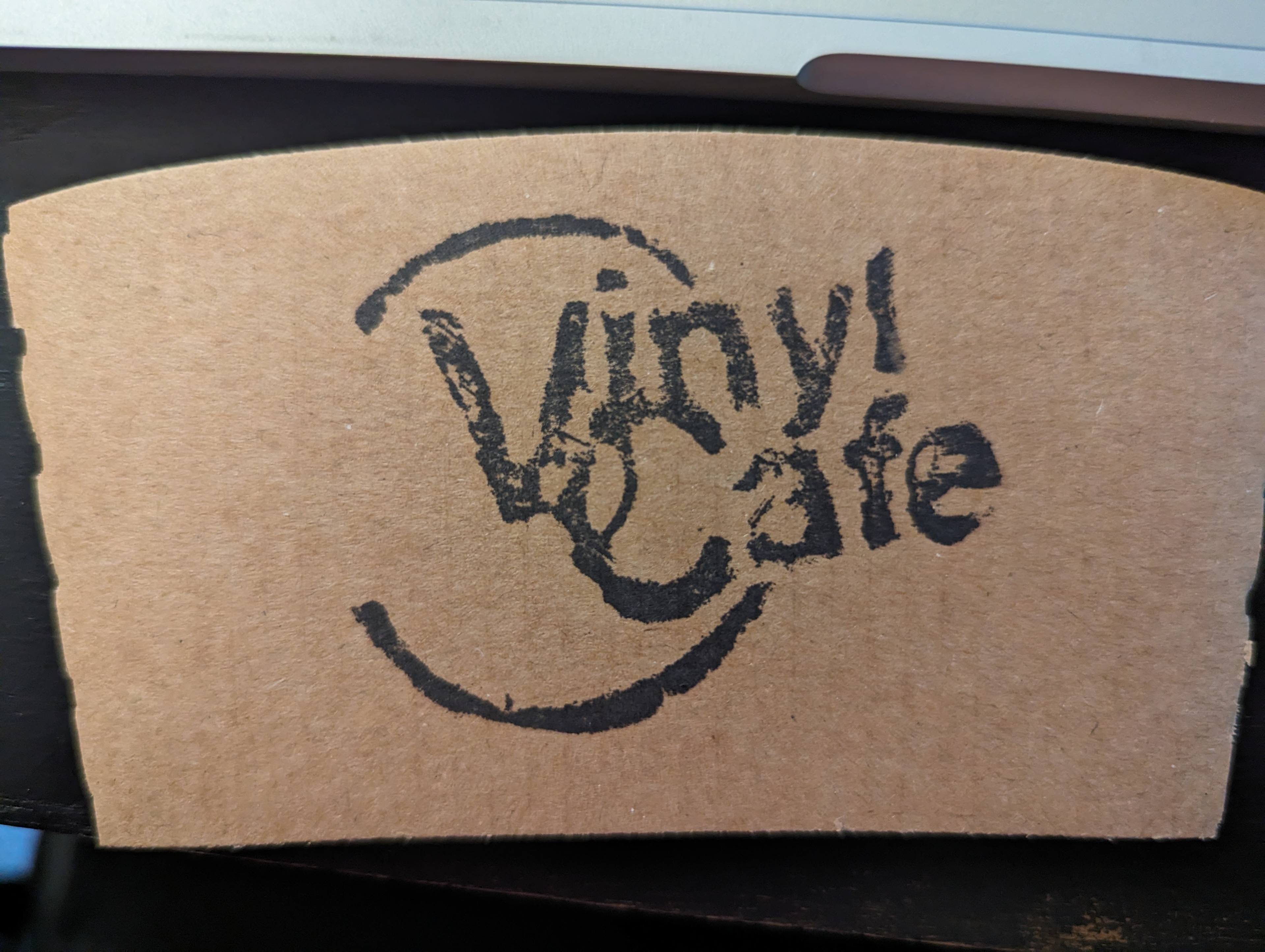
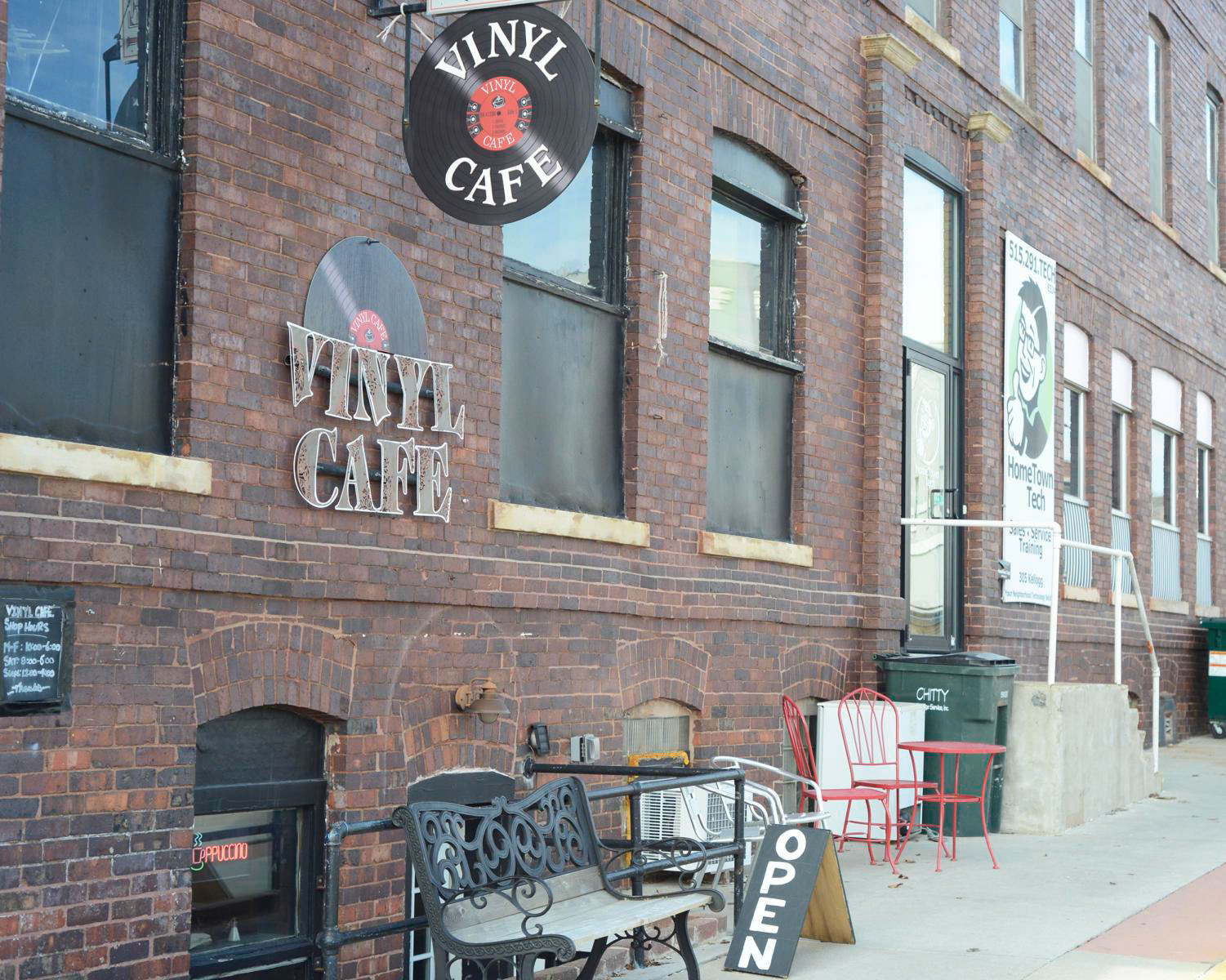
I started out initially by spending time there in order to both talk with the owner as well as get a general impression of the atmosphere of the cafe. I took a little bit of time to interview the owner and figure out what he would want from a rebrand. One thing to note is that the owner was looking to switch the branding to be the "Vinyl Grind" as opposed to the "Vinyl Cafe" as it had been previously known. Some of the key things I noted were wanting something simple, welcoming, and combining the three key parts of the cafe: music, coffee, and community.
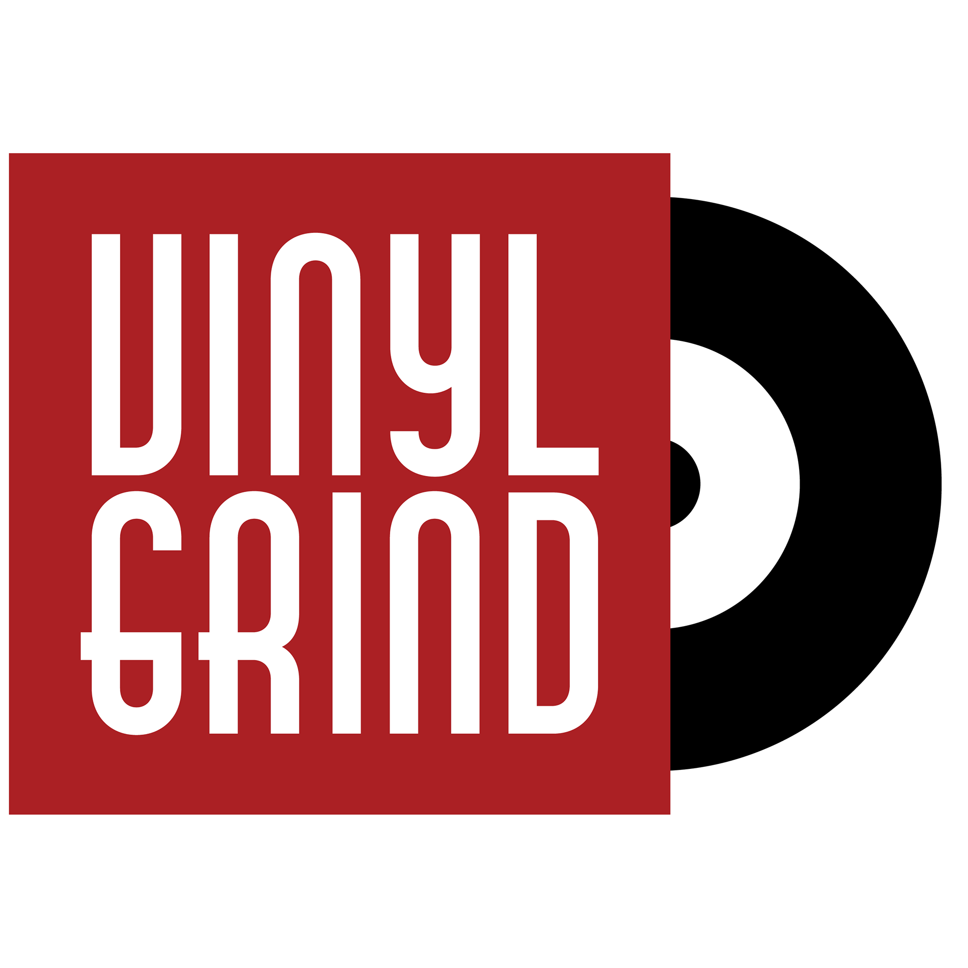
Concept 1
Concept 2
Concept 3
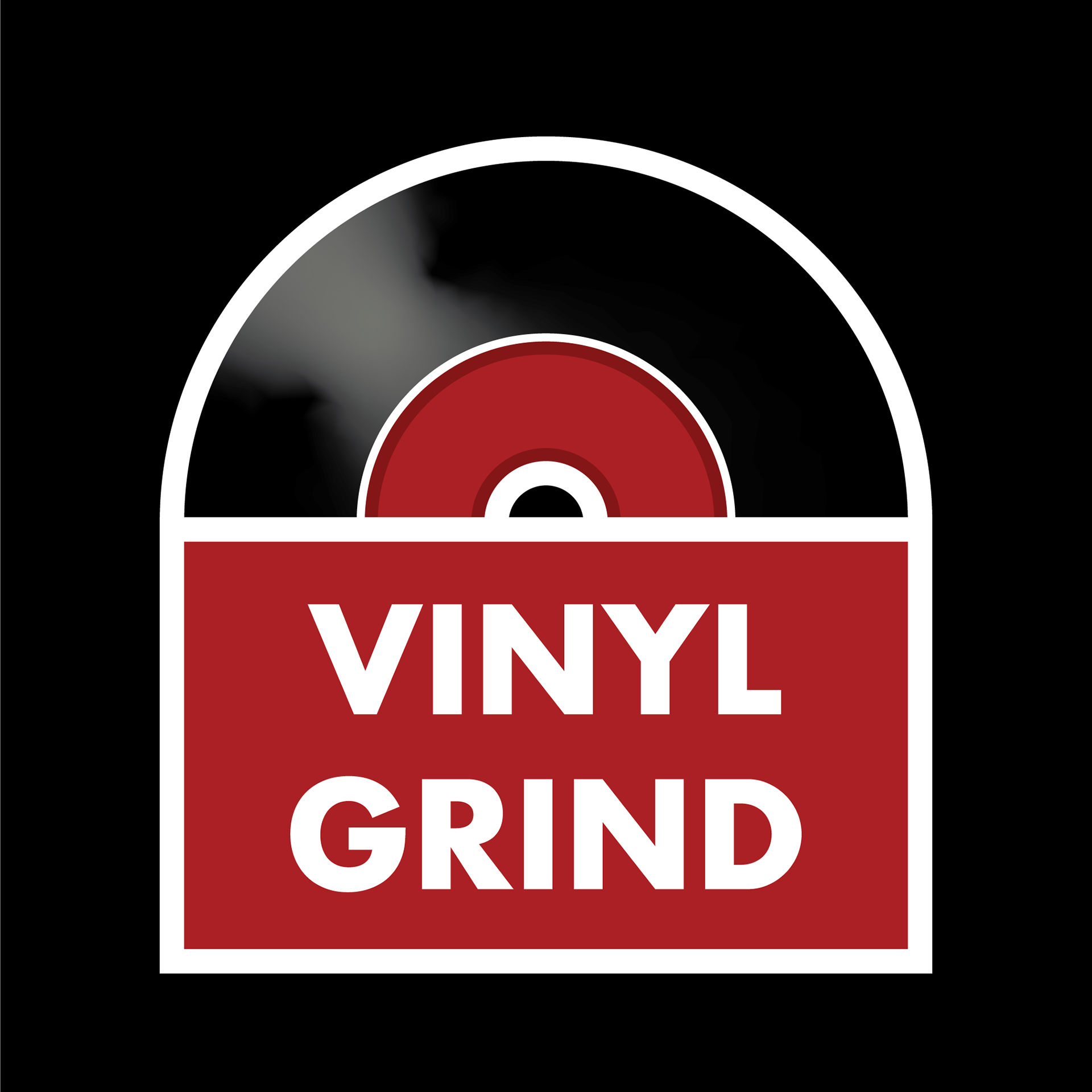
Concept 4
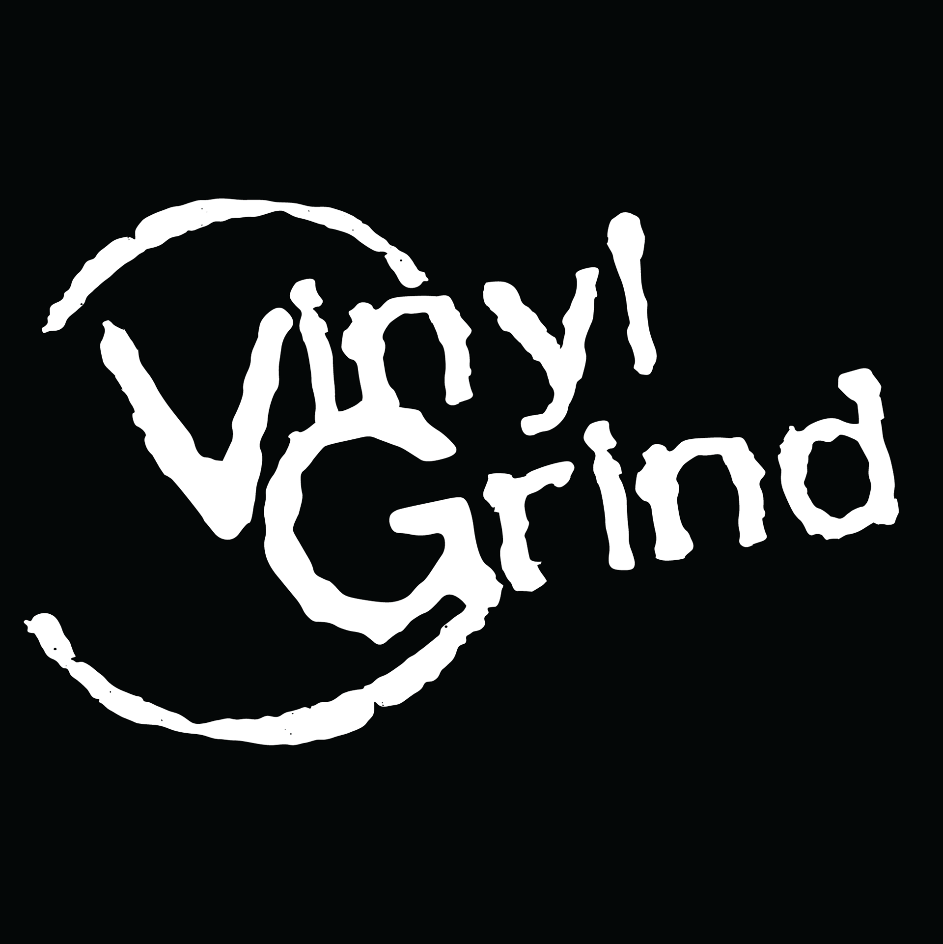
Concept 5 (Version of existing logo)
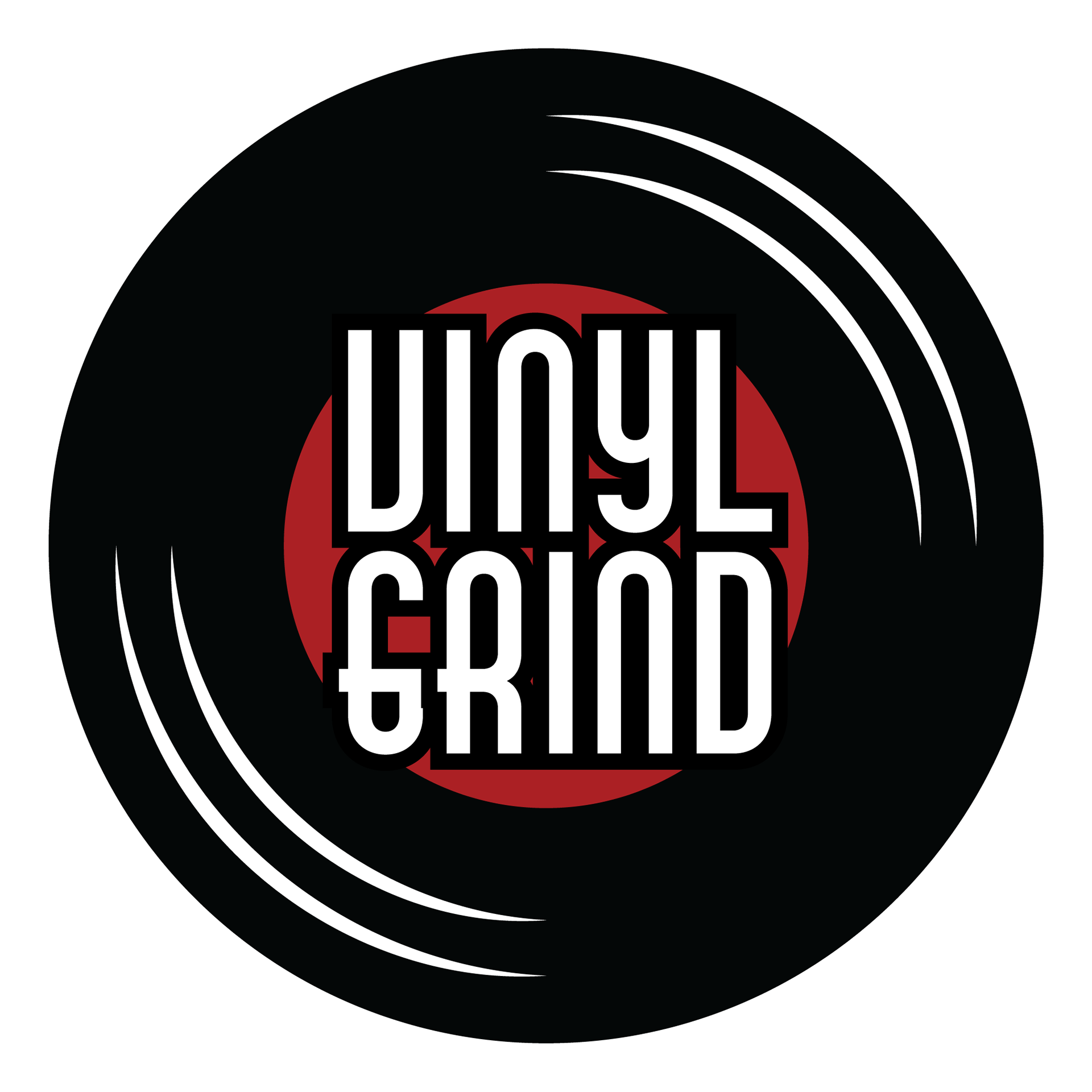
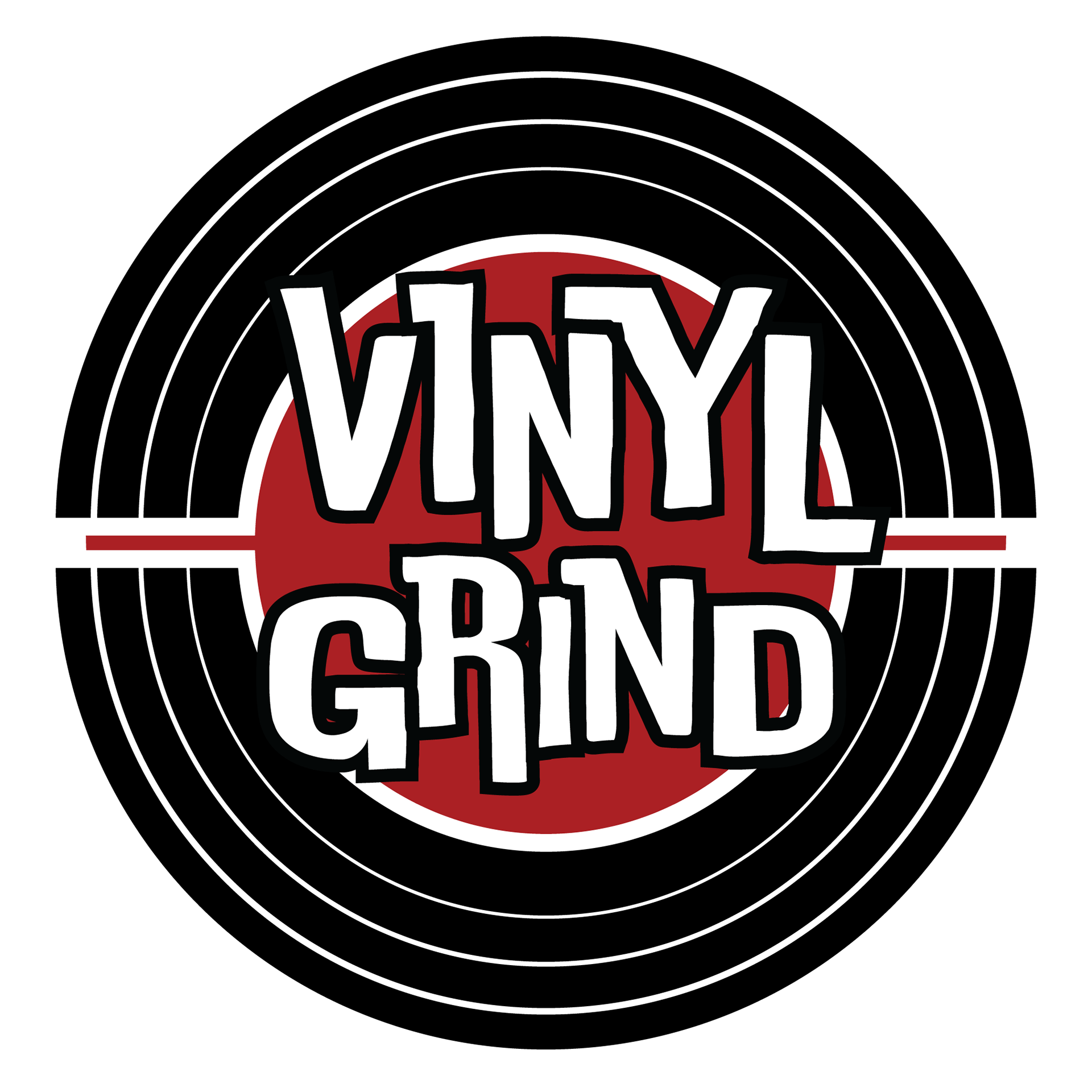
At some point, the Vinyl Grind had lost their original vectorized logos and assets, so I largely based my work on the ideas I had picked up from my talks with the owner. I tried out various concepts, including a version of their existing logo (see concept 5). I felt as though the versions of the logo were missing something, which led me to combine several traits I had liked from the multiple logos into one. The owner mentioned liking Concepts 2 and 3, and so I looked at those specifically. He also mentioned with concept 3 that the shape of the vinyl somewhat resembled a coffee cup and a vinyl, and so I decided to further that concept, ultimately arriving at the version that can be seen below.
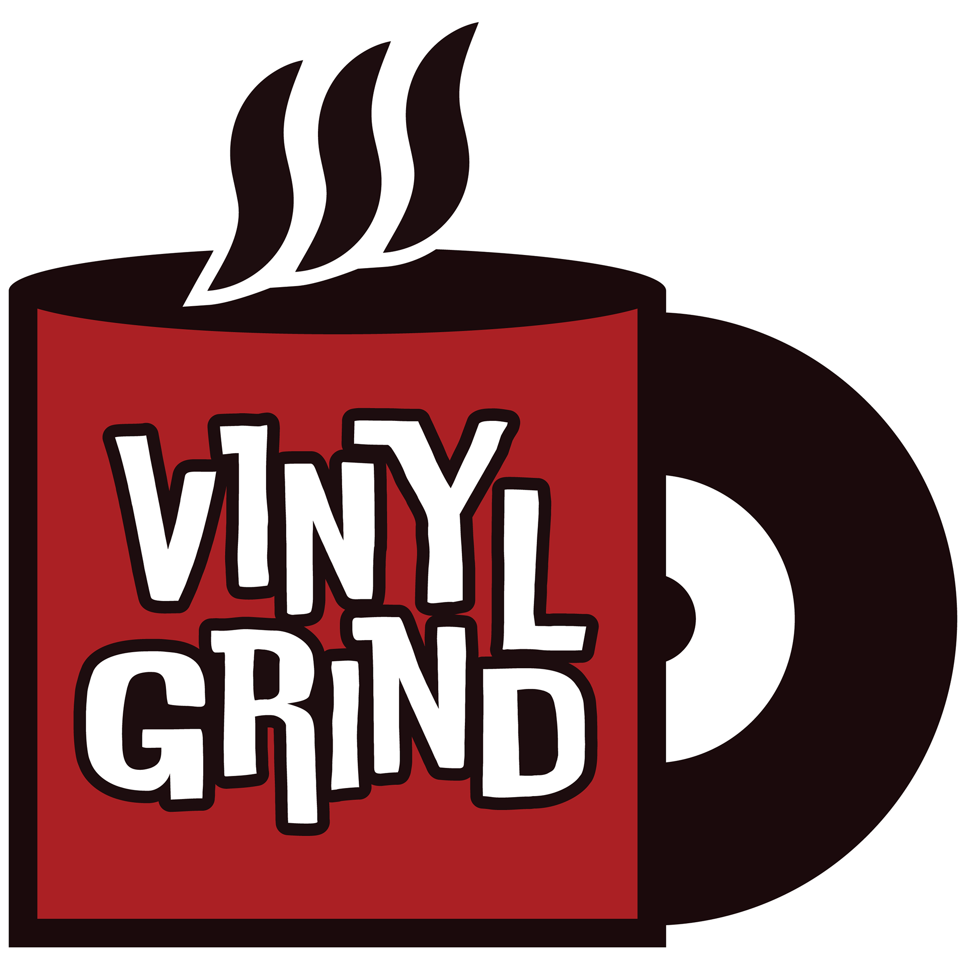
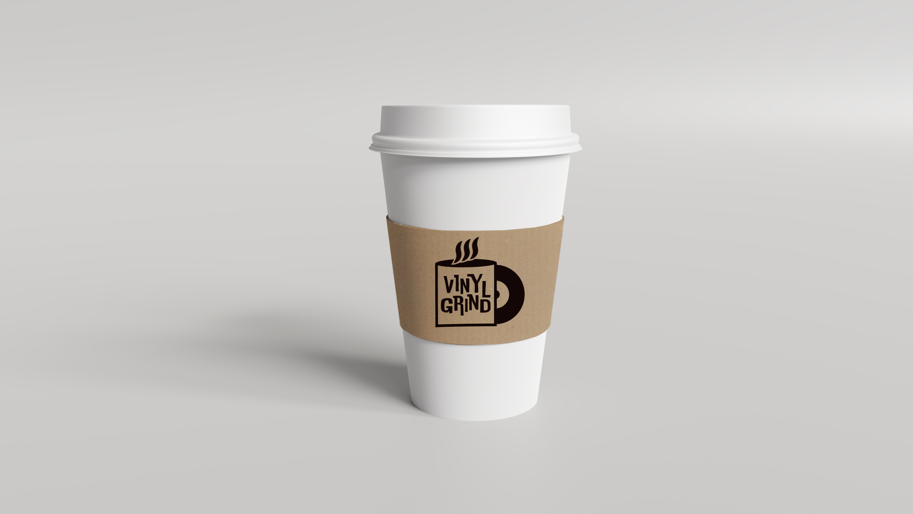
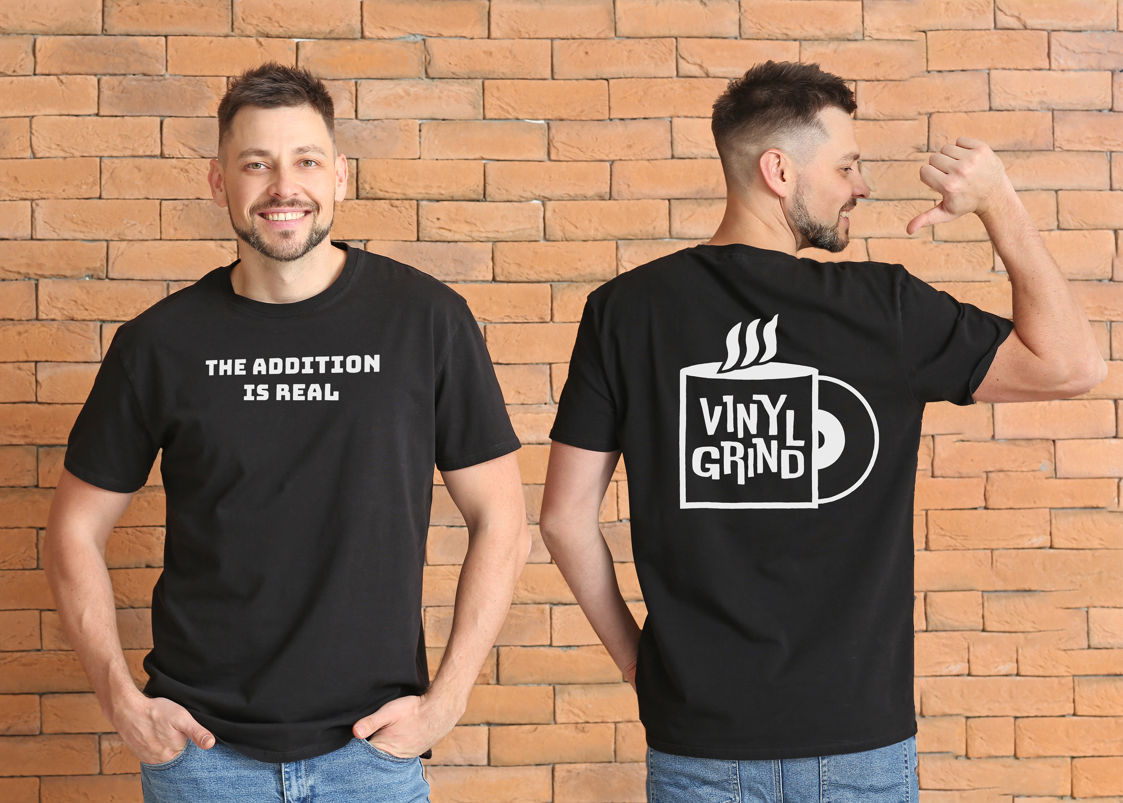
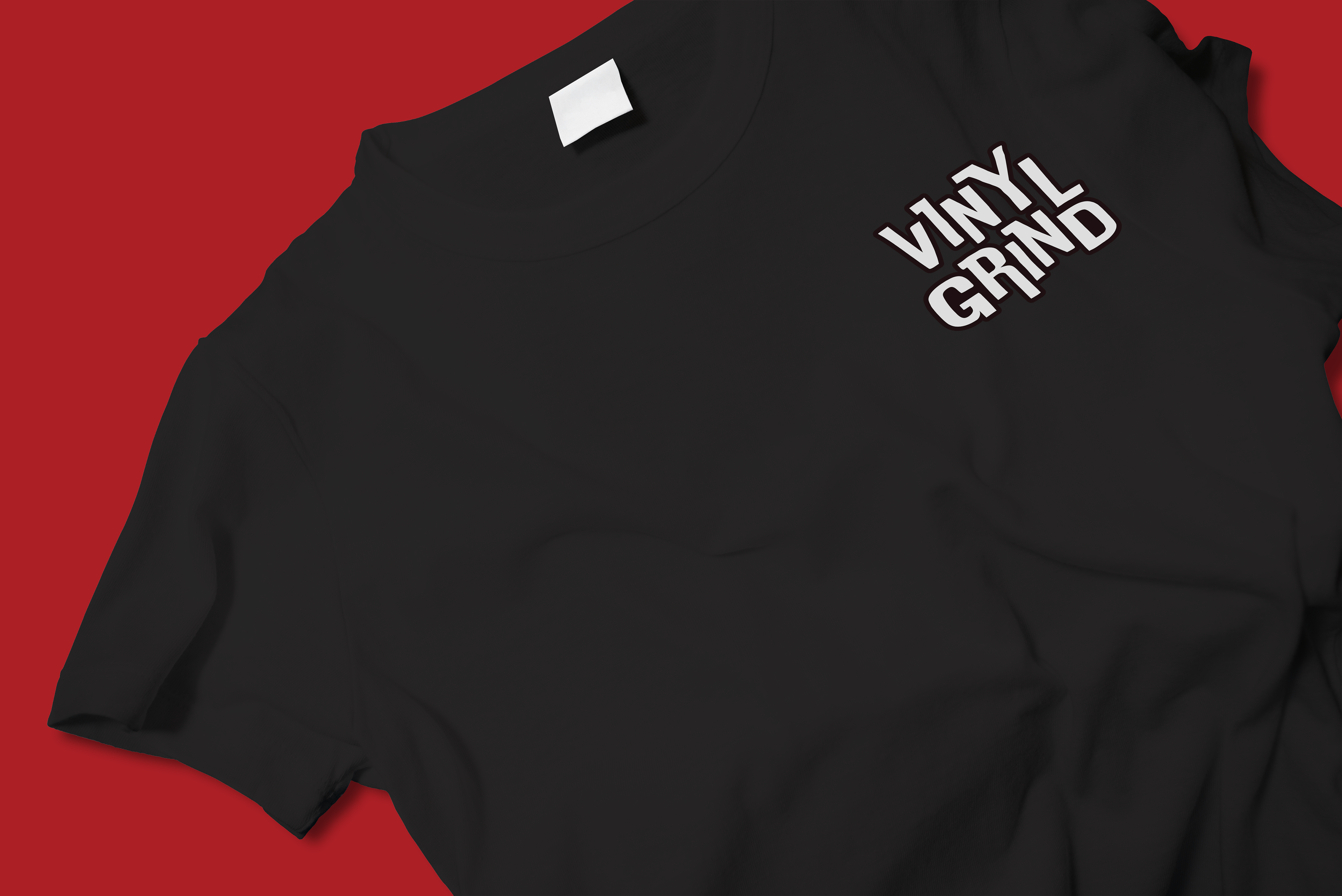
Below are several mockups I created to help represent the brand to the client.